 PaletteFinch
A softer set of colors
Muted palette illustration example
A muted palette can still have a clear focal point. This brief pairs a darker sage teapot with lighter clay and oatmeal details on a warm background.
Use this brief ↗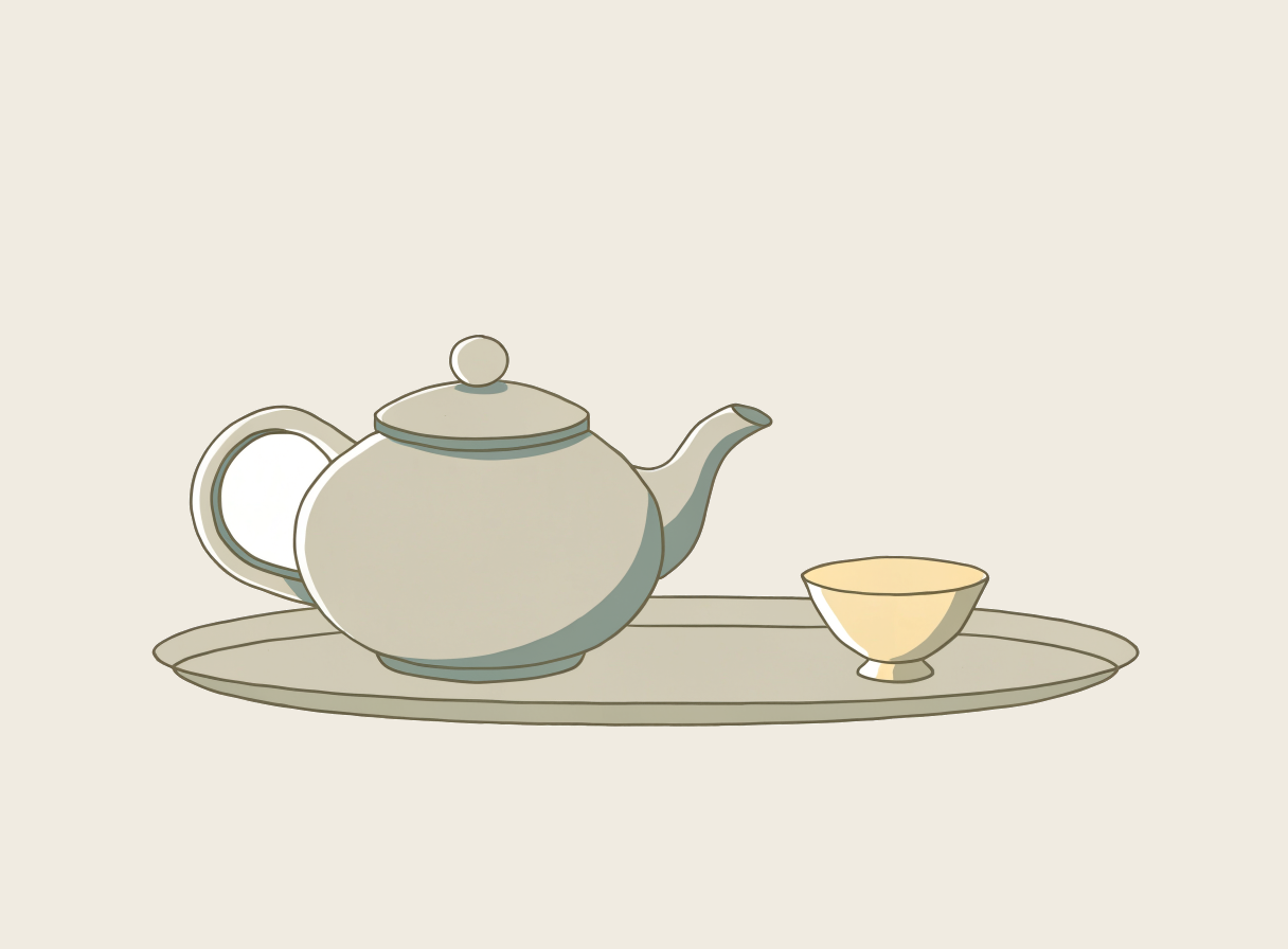
Keep the contrast. Soften the colors.
A calm newsletter header, a reading list cover or an editorial feature card.
- 01
Keep one palette color darker than the background so the main object has a readable outline.
- 02
Use the landscape format and ask for empty space on the right when the image will sit beside a title.
- 03
For a second version, change just the sage HEX. Keeping the same brief makes the color change easier to compare.
What to check in your result
The teapot, cup and tray use a softer palette than the earlier sample. The outer background was adjusted to the selected warm neutral, while the enclosed handle opening remains white to avoid painting over subject details. The pale yellow cup and highlights still sit outside the requested palette.